Improving the Blog
It wasn't even public
Starting Point
Don't laugh, the blog started out pretty rough.
Moving in to 2023 I felt that I'd reached my mid-blog-life crisis and a refresh was required.
Migrating to NextJS
NextJS provides a number of advantages over vanilla React:
- Static site generation
- MDX support
- File based routing
- Image optimisation
Converting to MDX
I've been using MDX for a couple of separate sites I've been building, - and it's made writing technical prose a breeze. Previewing blog content within the IDE, with images, prior to switching to the browser reduces time-to-production massively as well.
I decided to combine this with next-mdx-remote enabling static processing of MDX, with numerous plugins applied at compile time (discussed later). The docs themselves do declare:
if you are trying to build a blog for personal or small business use, consider just using normal html and css. You definitely do not need to be using a heavy full-stack javascript framework to make a simple blog.
but where's the fun in being a conformist...
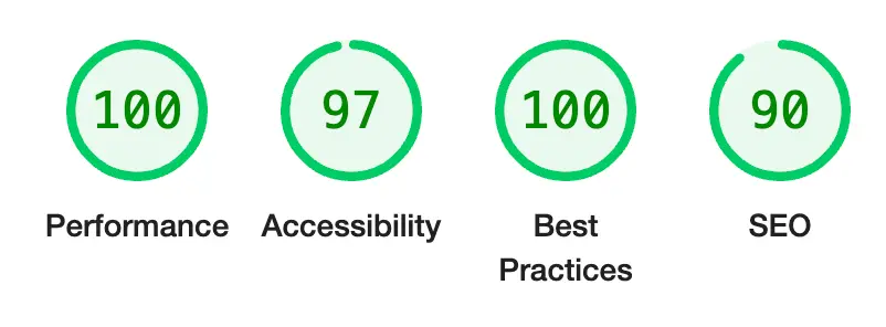
Also, the Lighthouse scores speak for themselves, especially for First Meaningful Paint times.
Article Metadata
Another benefit to nest-mdx-remote is the metadata being accessible from the markdown file itself, reducing the need
for manual intervention at compile times for display generation, and easy inclusion of article metadata in the HTML headers for SEO purposes.
Mine takes the format below:
---
title: Improving the Blog
description: It wasn't even public
date: '2023-03-03'
category: Technology
---
Thanks to mdx, alongside these changes I added some flavour for the article summary cards including the reading time
for each article (estimates based on markdown text-length), simple date sorting for recent article highlights utilising DayJS from the date
metadata, and categories which will be used in future tag filtering.
Tailwind
styled-components is a great library, but with some recent projects I've found it's a bit slower to prototype features,
with each element templated outside the primary render.
// styled-component
const Button = styled.button`
    margin: 1rem;
    padding: 1rem;
    @media (min-width: 768px) {
        padding: 2rem;
    }
    border-radius: 0.25rem;
    border: 2px solid blue;
    background-color: blue;
    color: white;
`;

const TestComponent = () => <Button>Hello world!</Button>;
Tailwind allows you to quickly prototype inline styling and easily group styling across multiple components. It's also pretty intuitive, so guessing commands becomes second nature (also has mature IDE auto-completion support).
// tailwind
const TestComponent = () => (
    <div className="text-base mg-1 p-1 md:p-2 rounded border-solid border-2
                    border-light-blue-500 bg-blue-500 text-white-500">
        Hello World!
    </div>
);
As you can imagine this becomes unreadable when you start to get multiple elements in the tree.
Plug-wins
I'm implementing both rehype and remark plugins as part of the site generation:
remark-gfm: Support for advanced Markdown features such as tables and footnotesrehype-slug: Appendsidattributes to each heading elementrehype-autolink-headings: Utilises theidattribute above, generating direct page section links.rehype-pretty-code: Code highlighting using theshikilibrary. Not just syntax highlights but line numbers, grouped highlights, css themes, and markdown metadata.rehype-img-size: Discussed below.
This is all implemented with a config variable:
const mdxSource = await serialize(content, {
    ...,
    mdxOptions: {
      format: 'mdx',
      remarkPlugins: [
        remarkGfm,
      ],
      rehypePlugins: [
        rehypeSlug,
        [rehypeAutolinkHeadings, { behavior: 'wrap', properties: { className: ['anchor'] } }],
        [rehypePrettyCode, {
          theme: {
            dark: 'monokai',
            light: 'one-dark-pro',
          },
          keepBackground: true,
          onVisitHighlightedLine(node) {
            // Each line node by default has `class="line"`.
            node.properties.className?.push('highlighted');
          },
        }],
        [rehypeImgSize, { dir: 'public' }],
      ],
    },
  });
Image Lazy Loading
As the website is statically generated, default lazy-loading for next/image elements is unsupported.
I've used the next-image-export-optimizer package to generate the images at build time, alongside the rehype-img-size
plugin. The plugin ensures that the image size can be extracted from the embedded markdown images, whilst the export provides images
in a number of sizes in the WebP format. This allows the image to be lazy-loaded by the browser, which can then be replaced
by the high-quality image for the correct page size once fully rendered.
const mdxConfig = {
  ...,
  transpilePackages: ['react-icons', "next-image-export-optimizer"],
  images: {
    loader: "custom",
    imageSizes: [16, 64, 128, 256, 384],
    deviceSizes: [320, 640, 1080, 1920, 2048],
  },
  env: {
    nextImageExportOptimizer_imageFolderPath: "public",
    nextImageExportOptimizer_exportFolderPath: "out",
    nextImageExportOptimizer_quality: 75,
    nextImageExportOptimizer_storePicturesInWEBP: true,
    nextImageExportOptimizer_exportFolderName: "nextImageExportOptimizer",
    nextImageExportOptimizer_generateAndUseBlurImages: true,
  },
}
const components = {
img: (props) => <ExportedImage {...props} priority={true} placeholder='blur' loading='eager' role='img' />,
};
...
<MDXRemote {...source} components={components} />Dark Mode
I thought this would be a relatively simple task, but it turned out to be more complicated than I'd anticipated.
The next-themes package provides a simple way to switch between light and dark mode, using the prefers-color-scheme media query,
and integrates nicely with tailwind.
import { useTheme } from 'next-themes';
import { useEffect,useState } from 'react';
import { RiMoonClearLine, RiSunLine } from 'react-icons/ri';

const ThemeToggle = () => {
  const [mounted, setMounted] = useState(false);
  const { theme, setTheme } = useTheme();

  // Show only when mounted on client, alleviating hydration issues
  useEffect(() => setMounted(true), []);

  if (!mounted) return <></>;

  return (
    <HeaderIcon onClick={() => setTheme(theme === 'light' ? 'dark' : 'light')}>
      {theme === 'light' ? <RiMoonClearLine size={25} /> : <RiSunLine size={25} />}
    </HeaderIcon>
  );
};
However, due to the fact that each page is generated from mdx, switching the styling is slightly more complicated.
To get around this I added scss ensuring that when the data-theme is switched, the correct code blocks are
displayed.
html.dark {
  pre[data-theme="light"],
  code[data-theme="light"] {
    display: none;
  }
}

html.light {
  pre[data-theme="dark"],
  code[data-theme="dark"] {
    display: none;
  }
}
Animation
To enter my final form:

I decided to add some eye-candy with framer.
Using the component below I'm able to introduce all 5 readers (generous) of the blog to the near imperceptible movement of a hand.
const HandWave = () => (
  <motion.div
    className='inline-block pl-1'
    animate={{ rotate: 20 }}
    transition={{
      from: 0,
      duration: 0.75,
      repeat: Infinity,
      repeatType: 'reverse',
      ease: 'easeInOut',
      type: 'tween',
    }}>
    👋
  </motion.div>
);
N.B. to get a slightly more noticeable effect it's also been added to the theme switcher:
<motion.div whileTap={{ rotate: 360 }}>
  <HeaderIcon onClick={() => setTheme(theme === 'light' ? 'dark' : 'light')}>
    {theme === 'light' ? <RiMoonClearLine size={25} /> : <RiSunLine size={25} />}
  </HeaderIcon>
</motion.div>
Give it a spin. Pardon the pun.
Fin
This can all be viewed on my repository if you're interested.